The beauty of renovating and in this case extending our home is that we have a complete blank canvas in respect to artwork coming in and even new furniture to go within the space.
The overall wall paint has taken this into account especially to make sure it doesn’t feel cold with a white that for example has too much grey in it or too old fashioned with too much cream. This would affect the artwork.
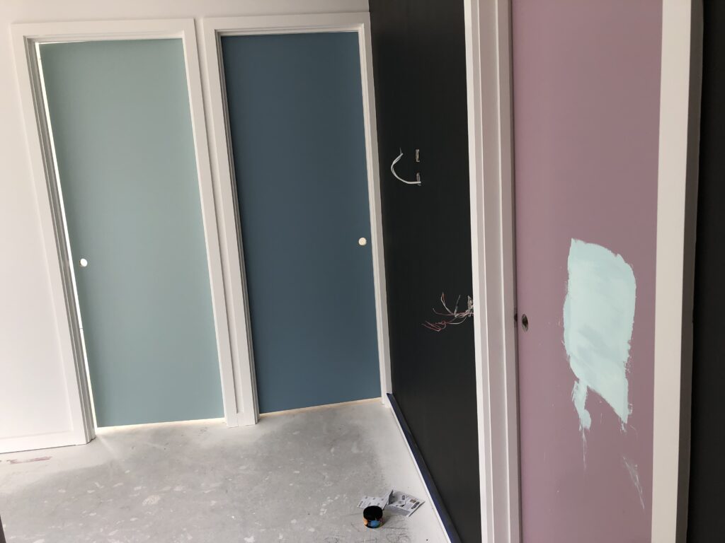
We have had fun with the kids bedroom doors and each of them has chosen a different colour to go on their door. They have chosen pastels, no orange and no avocado or browns in sight. We look forward to introducing additional colour with some of the bathroom tiles for the mid century feel.
We have a feature wall in the newer section of the kids hallway through to their living space. This will do two things; contrast the artwork and kids colourful doors along with complementing the black window frames and charcoal carpet. The whole house will have a modern feel internally with timber floorboards, charcoal carpet and white walls. The art and furniture will pick up colours and hopefully bring it all together.
Our main concern was making sure it felt warm without being cream and complementing the artwork. I love the contrast that white and black give and we certainly have that.
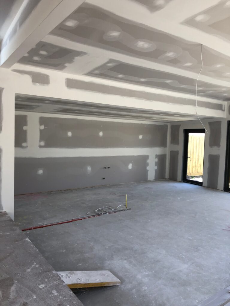
It’s crazy difficult to choose the right shade of white! I thought I would be able to without a problem but as you have said, we have vast areas of wall space and high ceilings so it had to be right. I am very fortunate to have a friend who is a paint guru in Shaynna Blaze. One phone call and she brought her whole colour wheel over. We ended up choosing the white (Princess Bling), the feature wall (Monument) and the kids chose their door colours with her help.